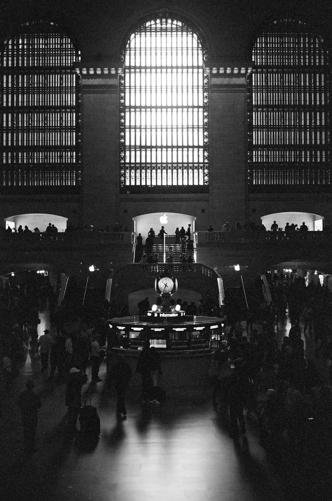
Olympus OM10 and Kodak BW400CN film.
I’ve never felt the chromogenic films really get low-light dark tones as well as they might. There is a speckled effect here which isn’t even the legendary “grain” – it just feels like something struggling.
But I’ve also not done these fully analogue for years (I always get dev and scans and just work with the digital files), and I suspect a silver print done shortly after developing would be much richer. Back in art school I expect this would have been one of those prints where the technicians and tutors would keep finding things I could improve on and it would be back into the darkroom to try again.
But, one has to ask, what does “richer” mean in an image anyway? Richer is an expression of wealth, or something like an intense tastebud experience. I guess it might mean… “more convincingly dark”; darkness in a digital image is where things start to head towards zeroes and the realm of less information. Those speckles look like something has just given up and said “I have nothing to work with here”.
But darkness is only the absence of light, not information, so it’s a tough one to rationalise, especially since with any image, even charcoal on paper, we need light in order to see darkness.